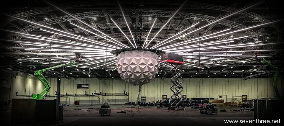
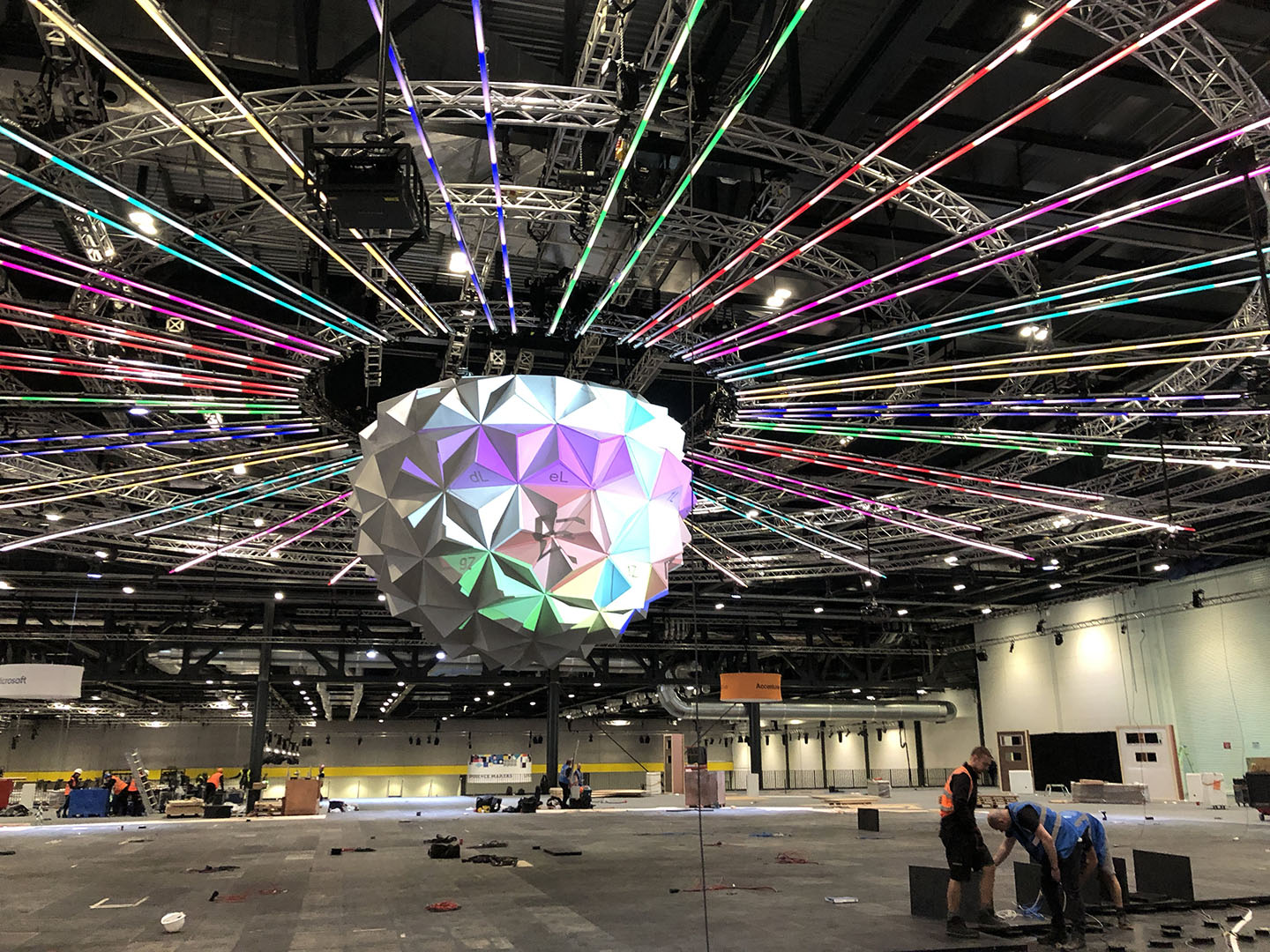
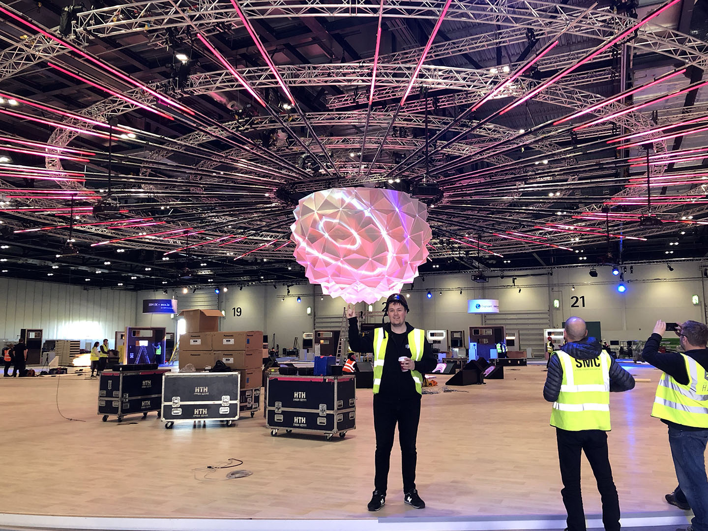
 This was the third year Pete from Hawthorn asked me to come and work on Adobe Summit London, the yearly meet about everything Adobe. I think it was around late Feb, Pete had been sent some ideas from Russel for the centrepiece of the delegates meeting area which was a 6m diameter object called “Pulse” representing brain of Adobe Sensei. The challenge with this one was to plan the projection so it was bright enough to be visible in the ambient light of the are and for the projector positions to be non intrusive.
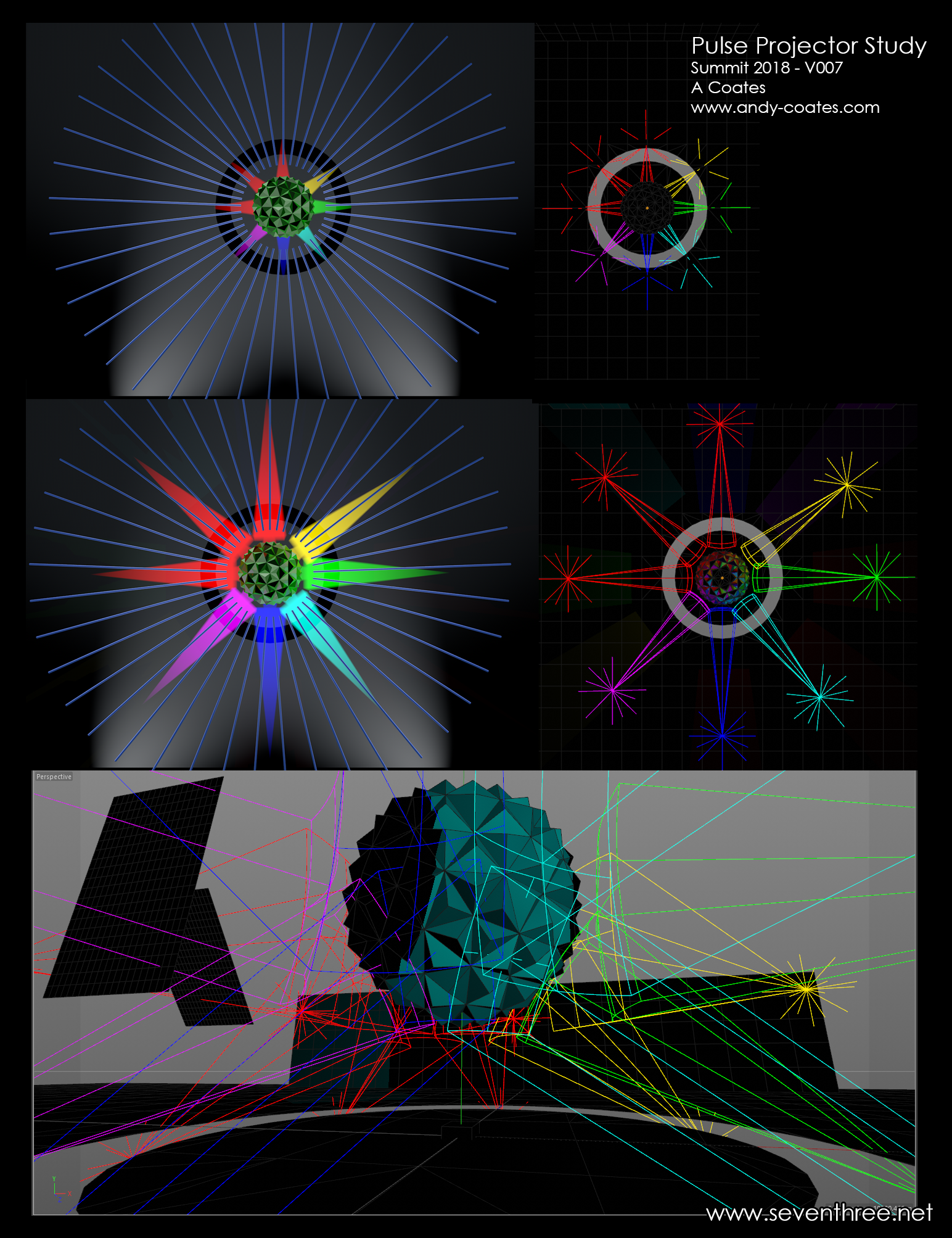
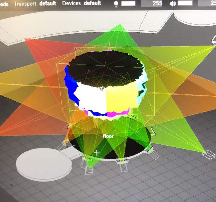
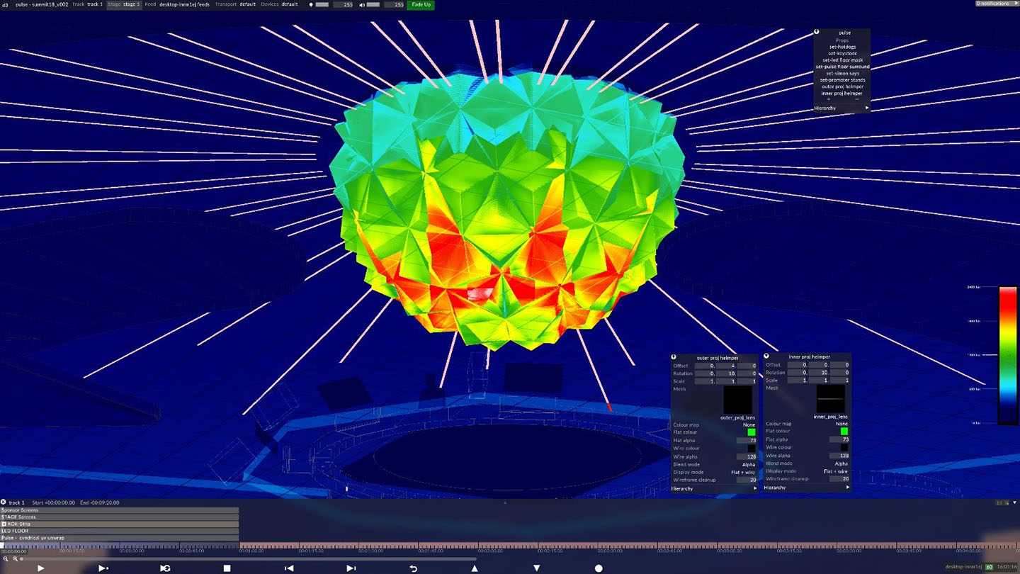
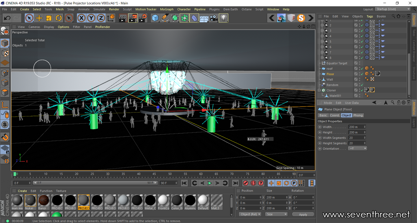 There was quite allot of email conversations and sharing visualisations of projector positions and trying to keep as even coverage as possible. I use a combination cinema 4d and d3 (disguise) to work out projection. Below is an early cinema screenshot and also a almost finalised d3 projector setup.
After finalising the study I asked Rich for a second opinionon the setup just to be sure. Rich had a beta release of d3_r15 and sent back lovely stage output showing the heat map with a thumbs up.
The Pulse was just one d3 element of the Adobe event I was looking after there was also the, plenary which was the main conference presentation area and also the party room where there was a 10m projection mapped tower. This video below by Hawthorn really shows off the event.
For the install and running of the event the d3 team consisted of Rich Porter, Sam Lisher and myself. We were together for the first few days for the install of the pulse then I branched off into the plenary where i was looking after the programming and running of the conference show. It was so so good working with Rich & Sam knowing that they could just make things happen and overcome any technical challenges. Rich, I’m sorry but the only photo I have of you two is you with your eyes closed.
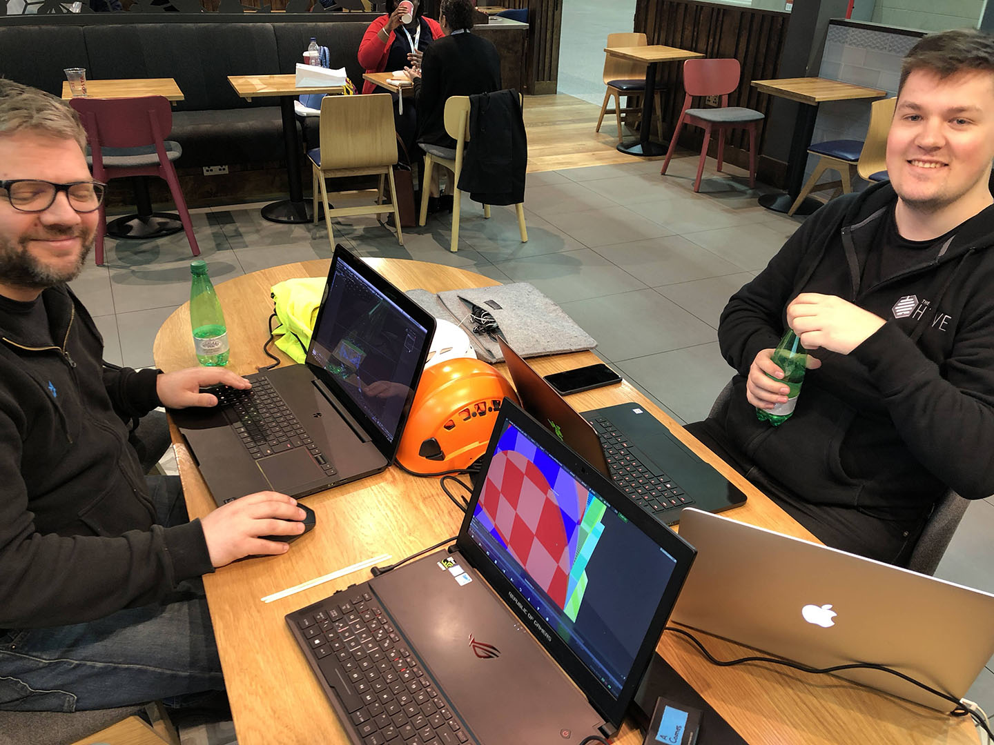
This was us in our coffee shop office in Excel finalising some of the 3d stuff and generally having geeky conversations.
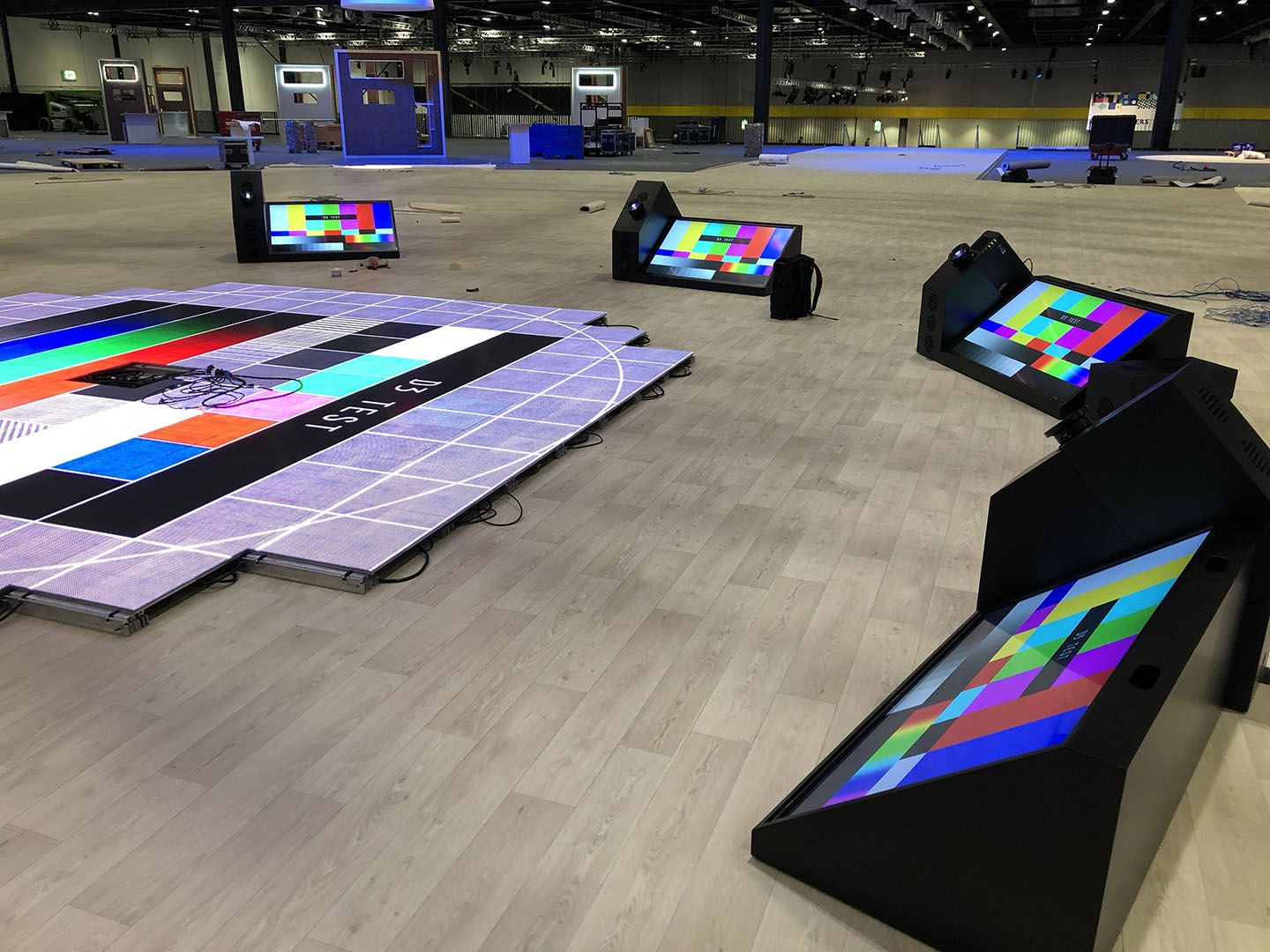
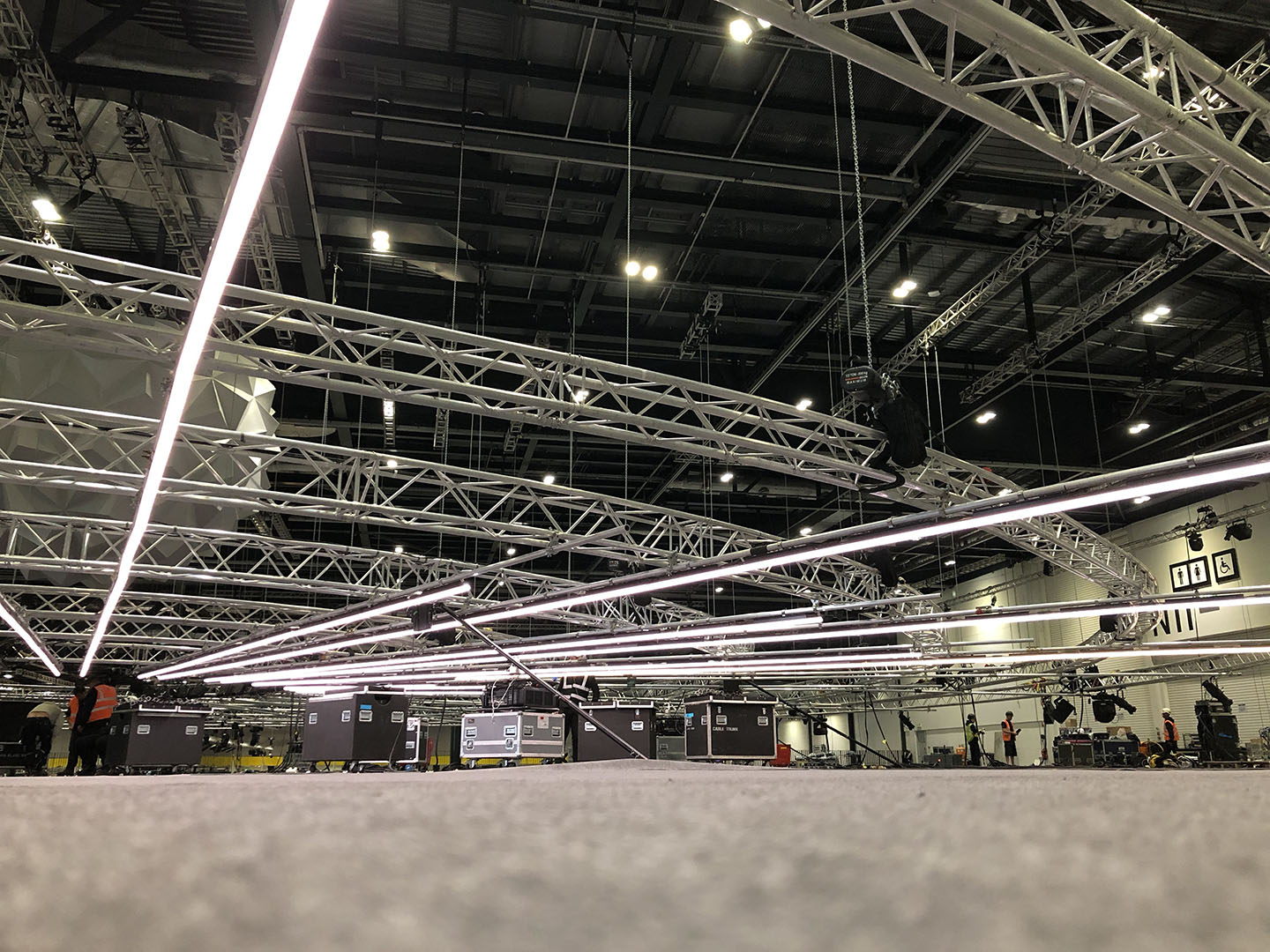
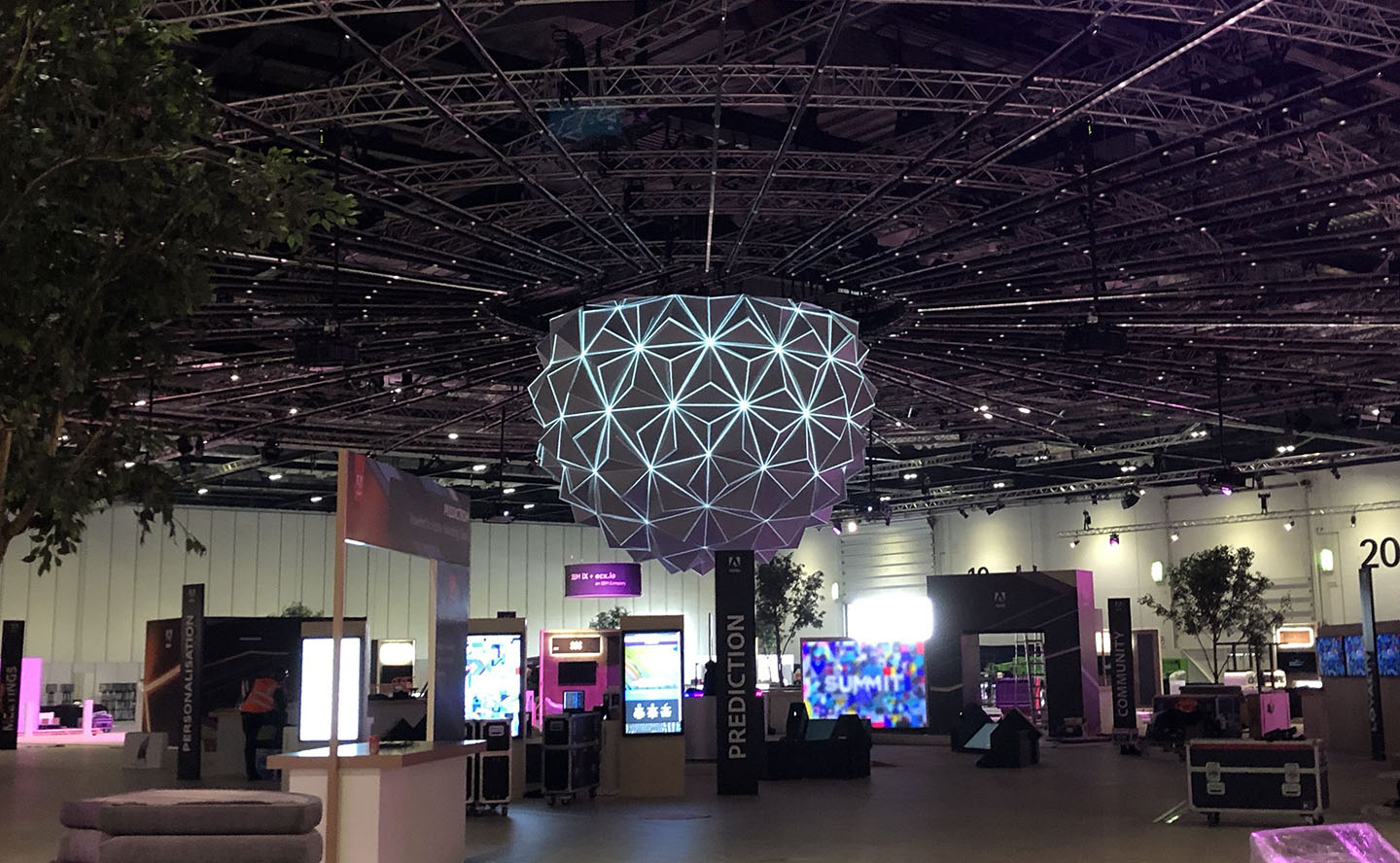
There was allot of physical assembly cabling and infrastructure to go into the gig to, of which Dave and his team did a Stirling job. In addition to the projection on the Pulse there was an LED floor, 8 monitors on the floor, 8 led screens around the perimeter and also a load of creative led tube displaying content.
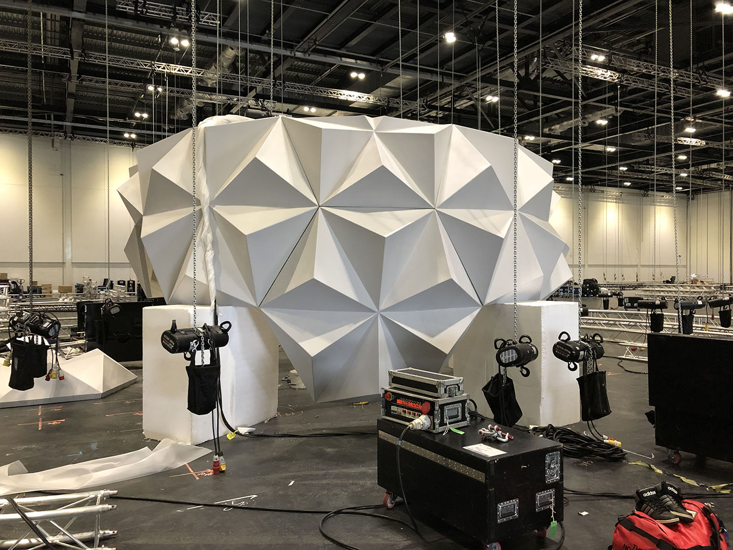
Pulse being assembled from its fibreglass component part above and below the creative LED tubes being rigged and put in place. It was nice to see the everything coming to life after spending a few weeks converting and UV’ing cad to OBJ for d3 .
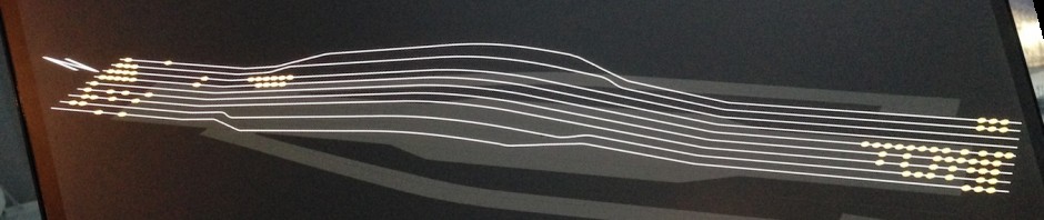
I spent quit a bit of time modelling and doing a tidy UV for the LED strip, below is the final version of the pixel map for the guys looking after the LED strip. Below is a top down view in d3 on the plane i applied the parallel map to push content to the led strips
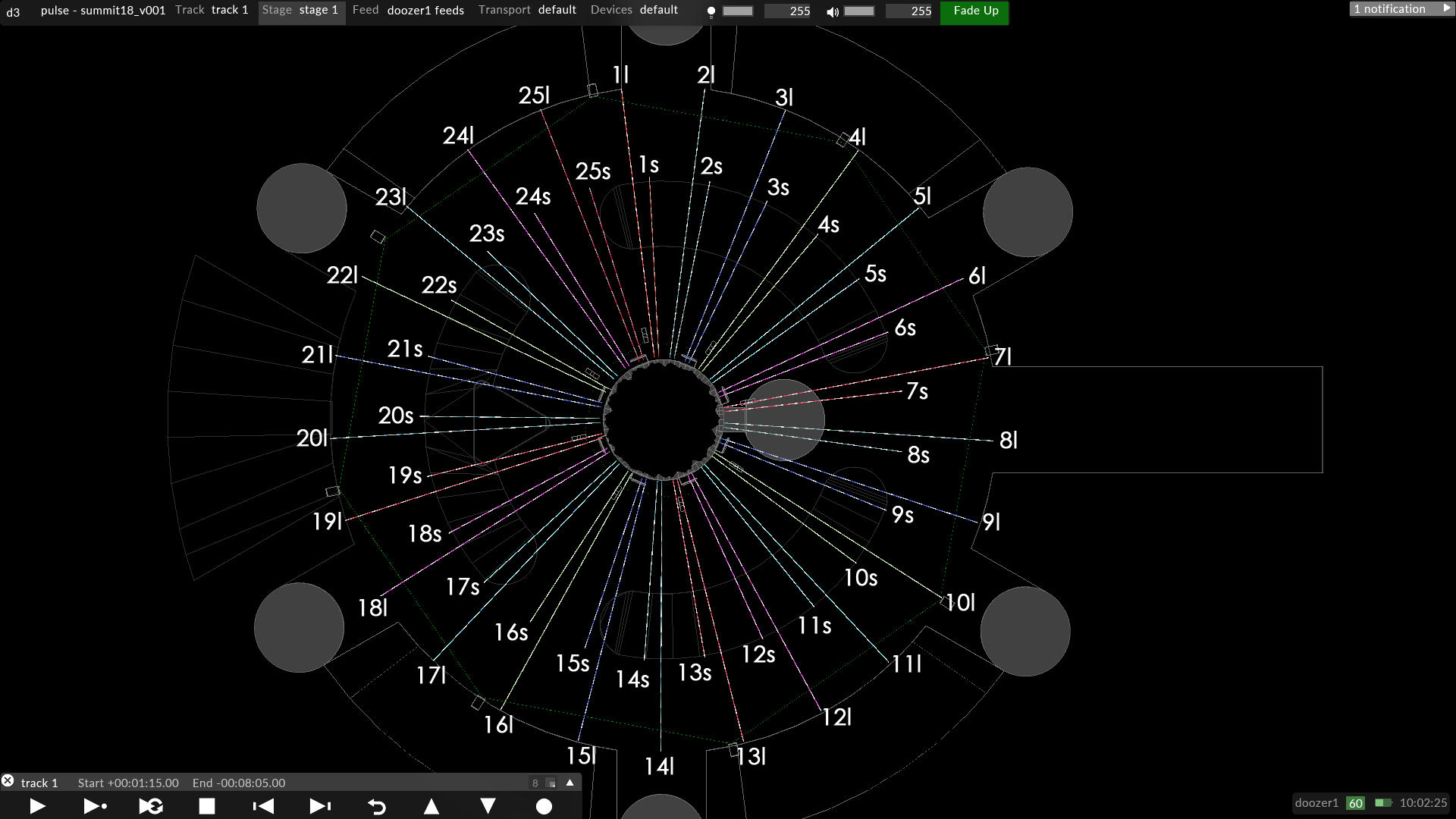
Below is the pixel template for the led strips which matches up with the above map. The top cluster are the long strips going in order 1 to 25 and the bottom cluster are the shorter led strips 1 to 25 top to bottom.
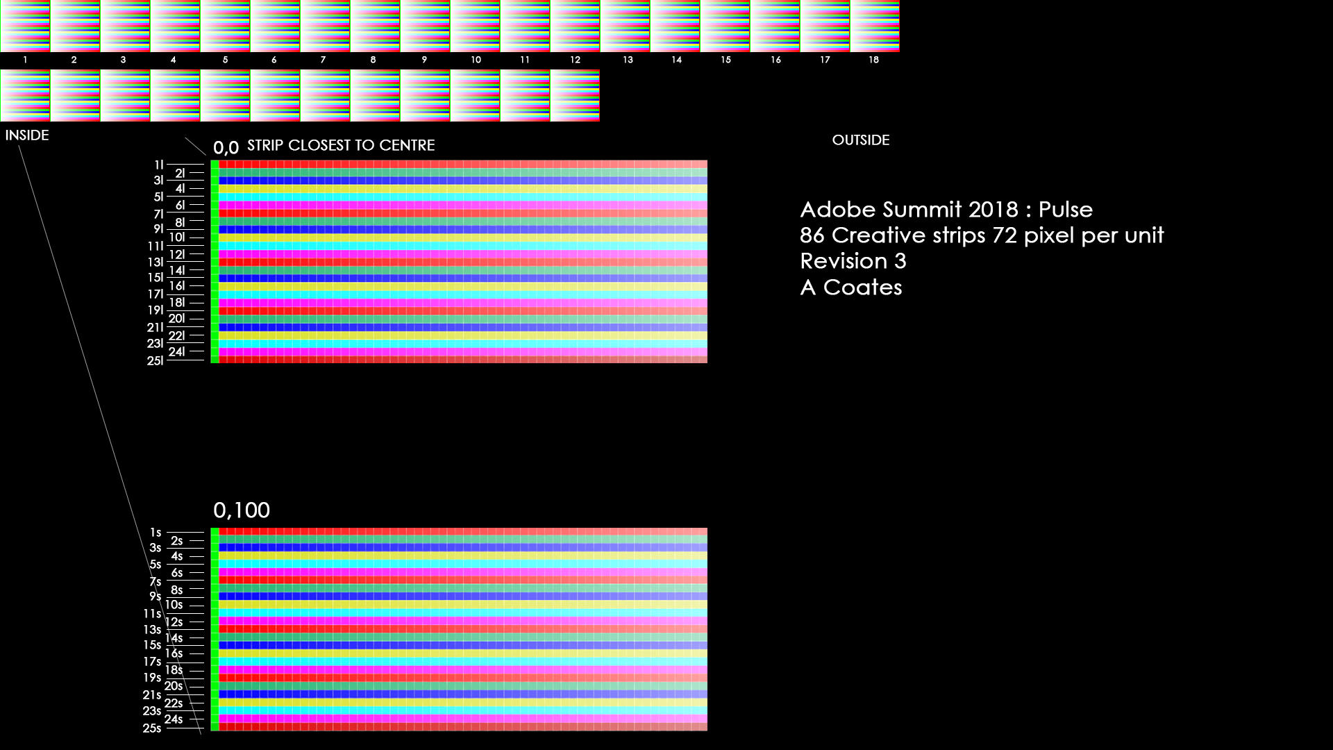
I also made the start pixel of each of the led modules in the physical construction green and the end pixel red with a coloured gradient to A show the run of led and B easy identify the direction of the module.
It such a feeling of satisfaction when it gets rigged and you drop the map in and it looks exactly how you planned it, much to the credit of Justin who was mapping the modules onto the map in the Brompton processors.
MESHING ABOUT
Things were well underway on the Sunday when I left Sam and Rich to do the line up on the pulse, there was a point where using quick cal we couldn’t line it up, things just weren’t dropping into place as normal. Pete had organised a laser scan of the structure and we had adjusted the existing model to the actual can data and it shoud have just lined up quite easy but it didn’t. We can only summarise that in the process of reducing the triangle count when converting taking the point could data to a mesh some edges and critical points had gotten “dulled” or discarded resulting in slightly off final mesh. Not to anyone fault as no-one was really away of how the fine tolerances we were working to. the rish to turn around the point cloud and reduce the size of the mesh to get it to us quickly in a small file size was probably a large factor in this. We eventually got the raw point cloud data and Rich re-meshed from scratch and after this everything started to work as expected.
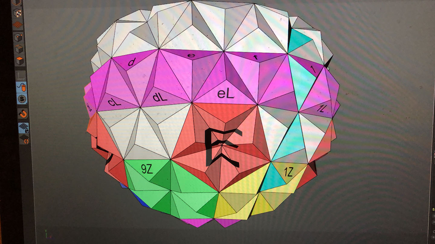
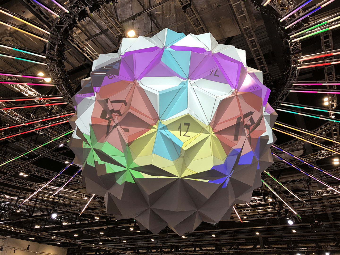
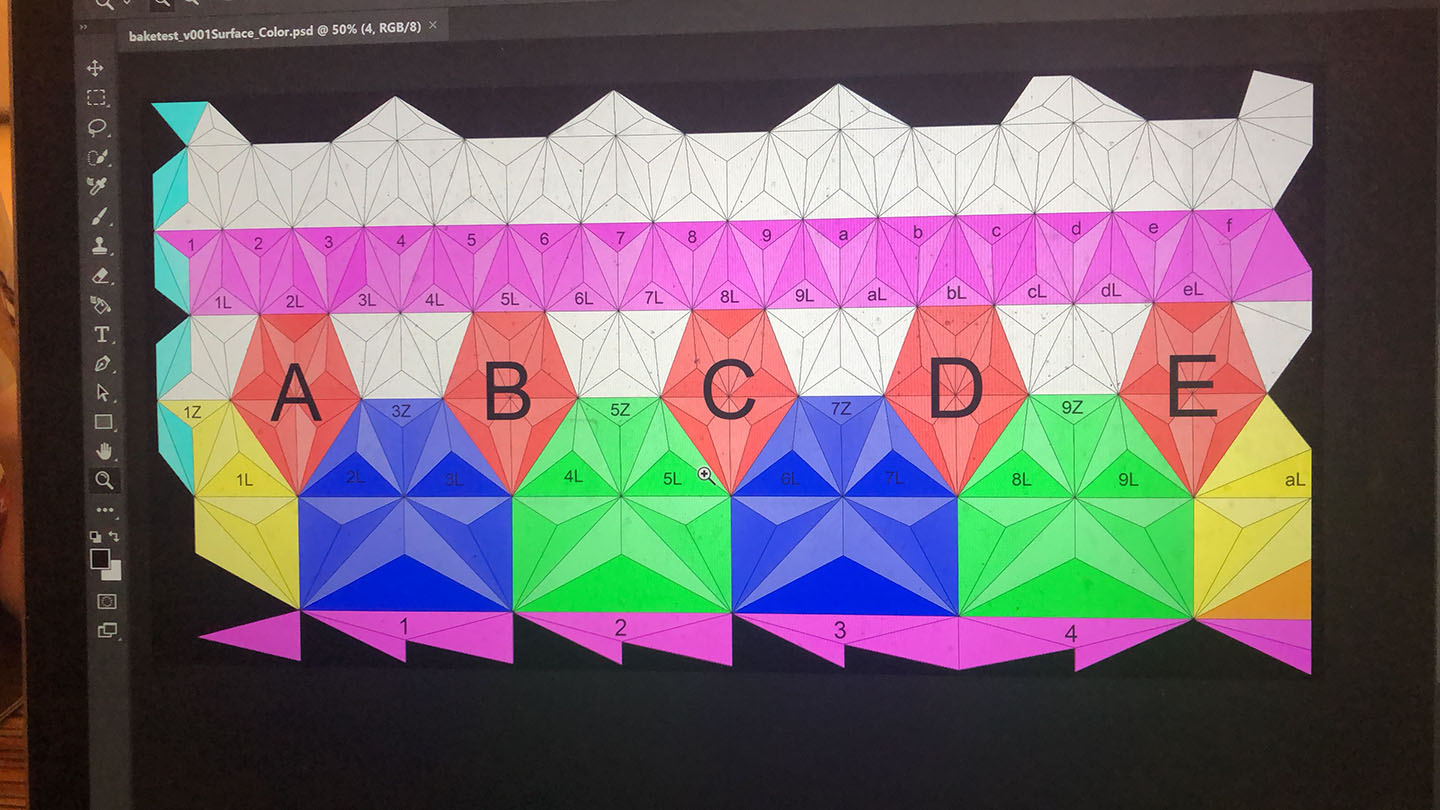
This is the UV for the Pulse, Cinimod did the content for the exhibit and took my OBJ and UV’d it to work best for their content creation. From here I got Cinimod’s UV’s pulse and generated a lineup grif by applying textures to the mesh and then baking this out onto the UV. I then added numbering and letters to identify key elements of the structure to have a fighting chance at lineup.
Sam and Rich done an fantastic job of lineup and blending everything as well a s programming the timeline to work with Cinimods OSC triggers from their interactivity software.
Sam (holding the pulse) & Rich (right)
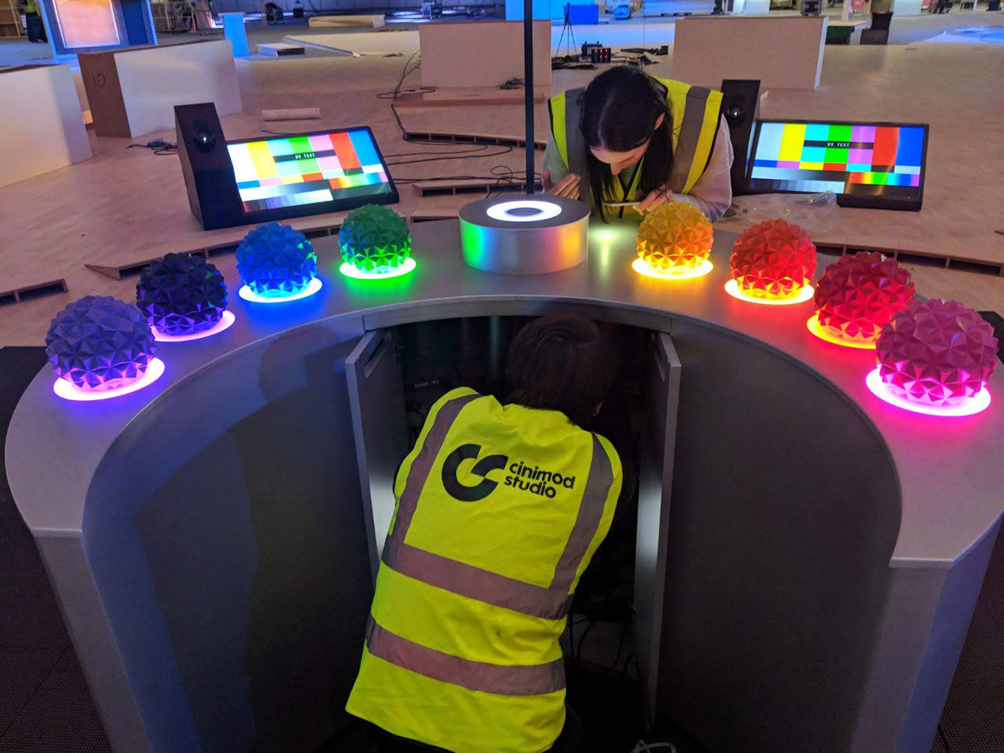
For the interactivity element of the Pulse, Cinimod created a station where delegates got their face scanned and placed a small version of the pulse onto the centre holder, and based off the users facial expression and their choice of pulse dictated what content was displayed on the floor, led pulse and surrounding floor screens.
So! That was a technical rundown of one element of Adobe Summit 2018 London, i wasn’t intending to write so much and have so many pictures but there you go, i couldn’t have described it with any less. The whole thing was brought together by massive team and credit to everyone for pulling a technically packed event well managed by Pete Harding.
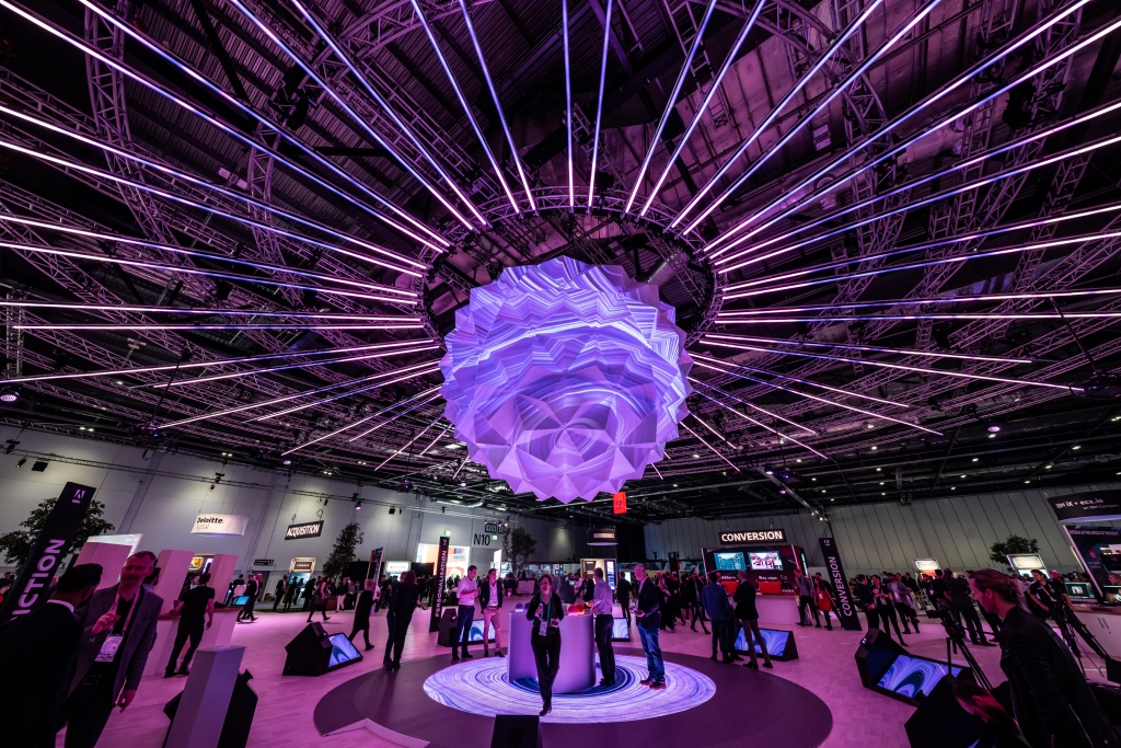 Image courtesy Taylor Bennett Partners & Hawthorn